
UI/UX Design in Nepal at a glance
Good design in Nepal has a few extra challenges. Users switch between English and Nepali, many are on small screens, and some are using a digital service for the first time. A layout that wins awards abroad can confuse someone ordering medicine for their parents in Biratnagar.
We design by watching people use things. Before we draw anything we look at analytics, talk to a few real users and test early sketches. The result is an interface that feels obvious, which is exactly the point.
Problems we fix
Users get lost
People can't find the button they need, so they call your office or give up.
Inconsistent screens
Every page looks a little different, which slows development and confuses users.
Design that can't be built
Beautiful mockups that ignore real content, slow networks or what developers can deliver.
What's included in our UI/UX design service
- UX research
- Analytics review, user interviews and competitor walkthroughs.
- User flows
- Step-by-step maps of key tasks like booking, checkout or sign-up.
- Wireframes
- Low-detail layouts to agree structure before visual design.
- Visual design
- High-fidelity screens for desktop and mobile in your brand.
- Prototype and testing
- Clickable prototype tested with 5–8 users.
- Design system
- Reusable components, colours and type styles for consistent builds.
What is the difference between UI and UX design?
UX (user experience) is about how a product works: what steps people take, what they need to see, and where they get stuck. UI (user interface) is how it looks: layout, colours, type and components. Good UX with poor UI feels clumsy; good UI with poor UX looks nice but confuses people.
In practice we do both together. We start with how people will use the product, sketch the flows as simple wireframes, test them with a few real users, and only then design the final screens. Skipping the first part is the main reason redesigns fail.
What do you get from a UI/UX design project?
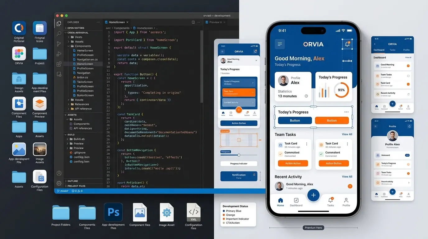
A clickable prototype in Figma, final designs for mobile and desktop, a component library your developers can reuse, and notes on spacing, colours and behaviour. For larger projects you also get user research findings and usability test results.
Design files are only useful if developers can build from them accurately. We name layers properly, set up auto-layout and design tokens, and stay available during development to answer questions and review what's built.
- User flows and wireframes
- Clickable Figma prototype
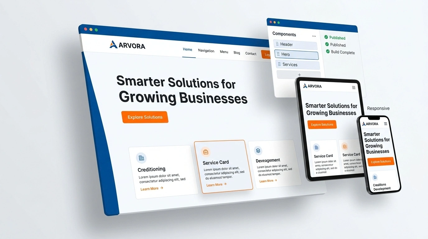
- Mobile and desktop designs
- Reusable component library
- Developer handoff notes
- Design QA during the build
How do you design for users in Nepal?
By testing on the phones and connections people actually use, writing labels in plain English or Nepali, and supporting the habits people already have: WhatsApp for contact, eSewa and Khalti for payment, and phone numbers rather than email for login.
Small details matter. A date picker that supports Bikram Sambat dates, prices written in the lakh format, and a phone-number login with OTP can make the difference between an app people use and one they uninstall.
When is a redesign worth it?
When people can't find what they need, drop off at the same step, or call your team for things the product should answer. A redesign that starts with those problems pays for itself. A redesign that only changes colours and fonts usually doesn't.
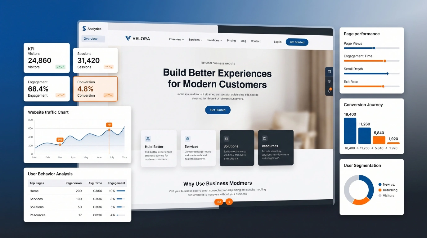
We start most redesigns with a UX audit: analytics, session recordings and five short user tests. It costs a fraction of a full redesign and often shows that fixing three screens matters more than redrawing thirty.
How do you test a design before it's built?
We put a clickable Figma prototype in front of five to eight real users, give them tasks like 'book an appointment', and watch where they hesitate. Fixing a problem in a prototype costs minutes; fixing it in code costs days.
What is a design system and do I need one?
A design system is a set of reusable components, colours and rules so every screen looks and behaves consistently. Any product with more than a handful of screens, or more than one developer, benefits from one.
By the numbers
Where the time goes in a typical UX project
Share of effort by stage on a mid-sized app or dashboard project. Research and testing take a third of the time and prevent most expensive rework.
View the data
| Item | Value |
|---|---|
| Visual design | 35% |
| Research & flows | 20% |
| Wireframes | 15% |
| Usability testing | 15% |
| Handoff & QA | 15% |
UI vs UX: what each covers
| UX (experience) | UI (interface) | |
|---|---|---|
| Question it answers | Can people do the task easily? | Does it look clear and on-brand? |
| Outputs | Research, flows, wireframes | Screens, components, styles |
| Measured by | Task success, conversion | Consistency, readability |
| When | First | After structure is agreed |
Common mistakes we fix
| Mistake | What we do instead |
|---|---|
| Designing from opinions | Designing from user tasks and testing |
| Different buttons on every screen | A reusable component library |
| Tiny text and low contrast | Readable sizes and accessible contrast |
| Desktop-first design | Mobile-first layouts for Nepali users |
How we work
- 1Week 1
Research
Understand users, goals and current problems.
- 2Week 1–2
Flows and wireframes
Agree structure before details.
- 3Week 2–3
Visual design
Full screens with your brand applied.
- 4Week 3–4
Test and refine
User testing and revisions.
- 5Ongoing
Handoff
Specs, assets and design QA during the build.
How much does UI/UX design cost in Nepal?
UX audit
Finding why visitors don't convert
NPR 30,000 one-time
- Heuristic review
- Heatmap + analytics review
- Top 15 fixes ranked
- Annotated screenshots
Website design
New sites or full redesigns
NPR 75,000 project
- User flows + wireframes
- Hi-fi Figma screens (desktop + mobile)
- Clickable prototype
- Design system
- Developer handoff
Product design
Apps, dashboards and SaaS
FromNPR 1,50,000 project
- User interviews
- Complete app UI
- Usability testing round
- Component library
- Design QA during build
Prices in Nepali rupees, excluding 13% VAT. Ad spend paid to Meta, Google or TikTok is billed separately. Every quote is fixed in writing before work starts.
What changes the price
| Factor | How it affects your cost |
|---|---|
| Number of screens | A 10-screen app costs less than a 60-screen platform. |
| Research depth | More interviews and test rounds add time but reduce risk. |
| Design system | A full component library is an investment that speeds every future build. |
| Languages | Designing for English and Nepali text lengths takes extra care. |
Tools we use
- ReactWeb interfaces
- Next.jsServer-rendered sites
- TypeScriptType-safe code
- Node.jsAPIs and back ends
- LaravelPHP applications
- WordPressContent sites
- WooCommerceOnline stores
- FlutterAndroid and iOS apps
- FigmaUI/UX design
- CloudflareCDN, security, hosting
Want the full picture? See every technology and platform we work with.
Guides to read next
UI/UX Design: frequently asked questions
What does a UI/UX designer deliver?
User flows, wireframes, high-fidelity screens, a clickable prototype and a design system your developers can use.
How much does UI/UX design cost in Nepal?
A UX audit is NPR 30,000. Website design is around NPR 75,000. App and dashboard design starts at NPR 1,50,000.
Do you only design, or also build?
Both. You can hire us for design only, or design and development together.
Can you redesign our existing app?
Yes. We start with an audit of what works and what doesn't, then redesign in phases.
Do you design in Nepali?
Yes. We test layouts with Devanagari text so nothing breaks.
Which tool do you use?
Figma, which lets you comment directly on the designs.